Back to Computer Sharing Skills Index
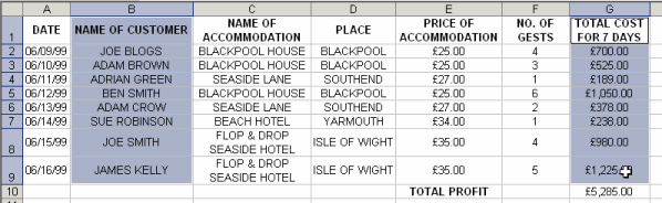
1) First highlight the columns you want on your graph/chart. In this example highlight only Name of Customer and Total Cost for 7 days columns but not cell G:10 - total profit
a) Hover your mouse over cell B:1
b) When mouse changes to a white + plus sign, hold left mouse button down and drag/move down until cell B:9, then let go of mouse button.
c) Hold down CTRL key
d) Hover your mouse over G:1
e) When mouse changes to a white + plus sign, hold left mouse button down and drag/move down until cell G:9, then let go of mouse button. Then let go of CTRL key
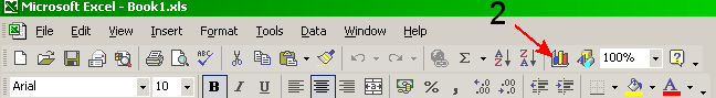
2) Click on the Chart button on the toolbar.
3) A window will open - Select the chart type by clicking on the name (i.e. Column) in the chart type box (indicated by arrow a) and chart sub-type (i.e. click middle left box) (indicated by arrow b)
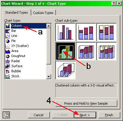
4) Click Next >
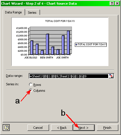
5) Make sure Columns is selected (if not then left click on Columns) (arrow a) and Click Next > (arrow b)
6) If you want to change the main title name, click on the box chart title and type in your new title. (indicated by arrow a)
7) To give the X-axis a name (the horizontal axis) then click on the box labelled ‘Category (x) axis’ and type in your title. (indicated by arrow b) (i.e. Name of Customer)
8) To give the Y-axis a name (vertical axis) then click on the box, 'Value (Z) axis’ and type in your title.
(Indicated by arrow c) (i.e. Cost Total)
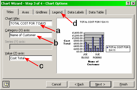
9) Click Legend tab (Indicated by arrow d)
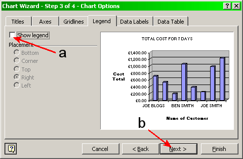
10) Untick the Show legend box (Indicated by arrow a) then click Next > (indicated by arrow b).
11) The last window will now appear. Click on ‘As new sheet’ (indicated below by arrow a).
12) To give your chart a name, click on the box with ‘chart 1’ (indicated by arrow b), delete and then type in your 'new sheet' title (i.e. Total Cost For 7 Days).
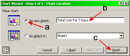
13) Now click Finish (indicated by arrow c). The chart below will now appear
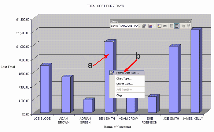
14) If you want to make each Bar/Column a different colour, then you must first click the RIGHT mouse button on one of the Bars/Column (indicated by arrow a) and left click on Format Data Point. (indicated by arrow b - see image above)
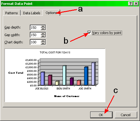
15) Click on Options tab. (indicated by arrow
a below)
15) Now click the left mouse on the tick box ‘Vary colours by point’.
(indicated by arrow b below)
16) Then click OK. (indicated by arrow c below)
Back to Computer Sharing Skills Index